MenuClose
Social
Visual identity - Competition Concept
Design of a Visual Identity for a Brewery
About
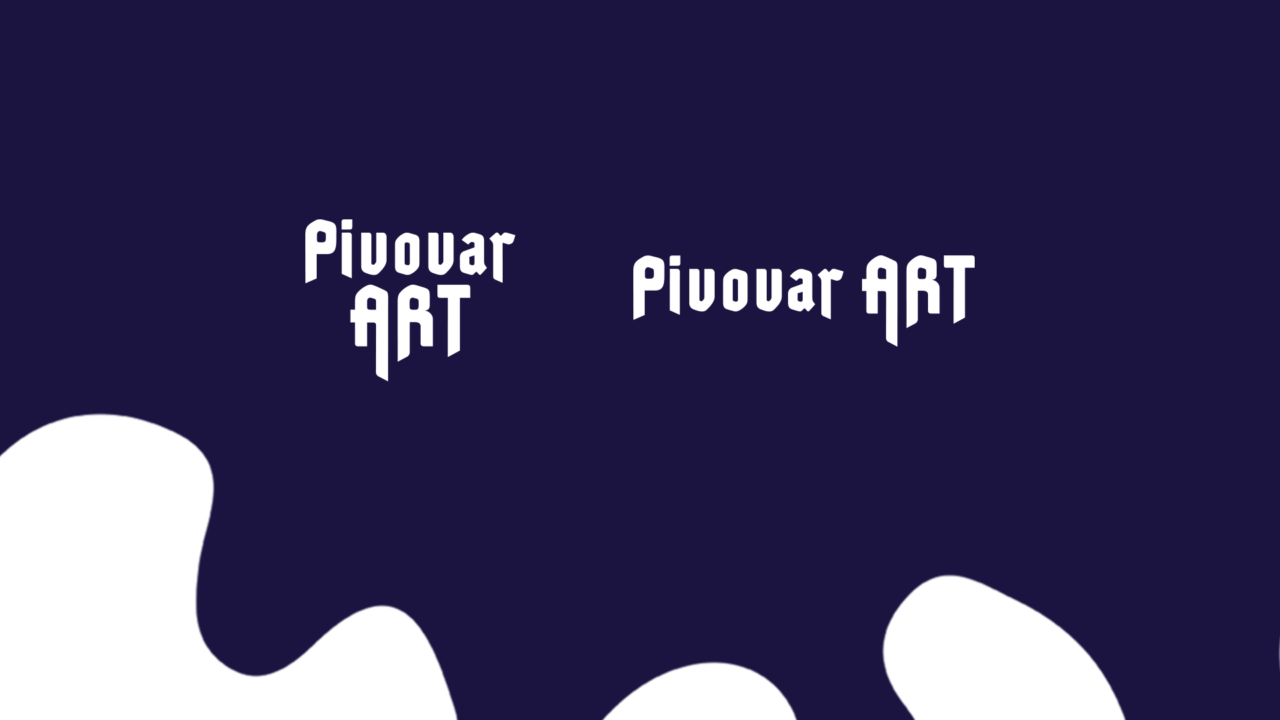
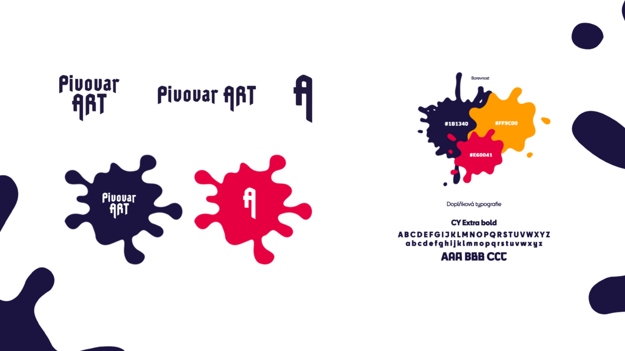
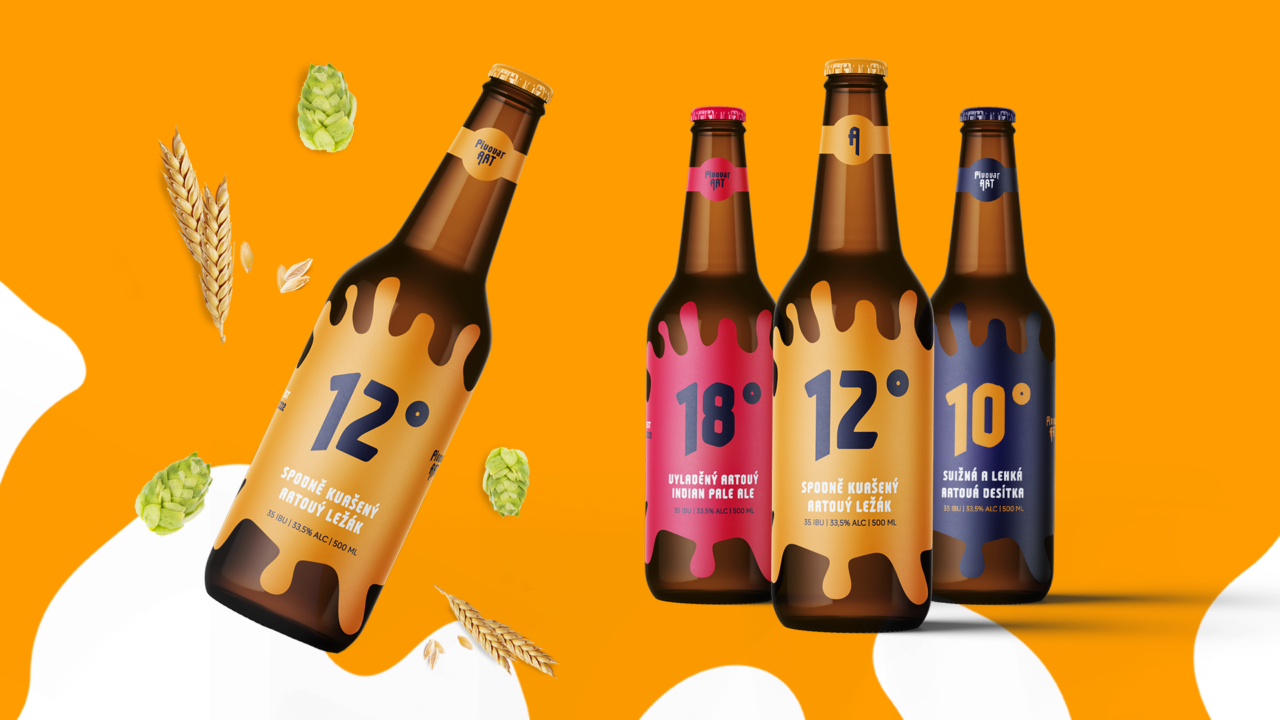
For the Brewery Art visual identity competition, I created a design concept inspired by classic brewery logos, particularly in its typography, which pays homage to traditional brewery logo design. The chosen typeface offers several stylistic variations, enabling unique and original applications while keeping the overall style coherent and consistent. This approach reflects a connection to art, where each visual element feels like a unique piece of work.
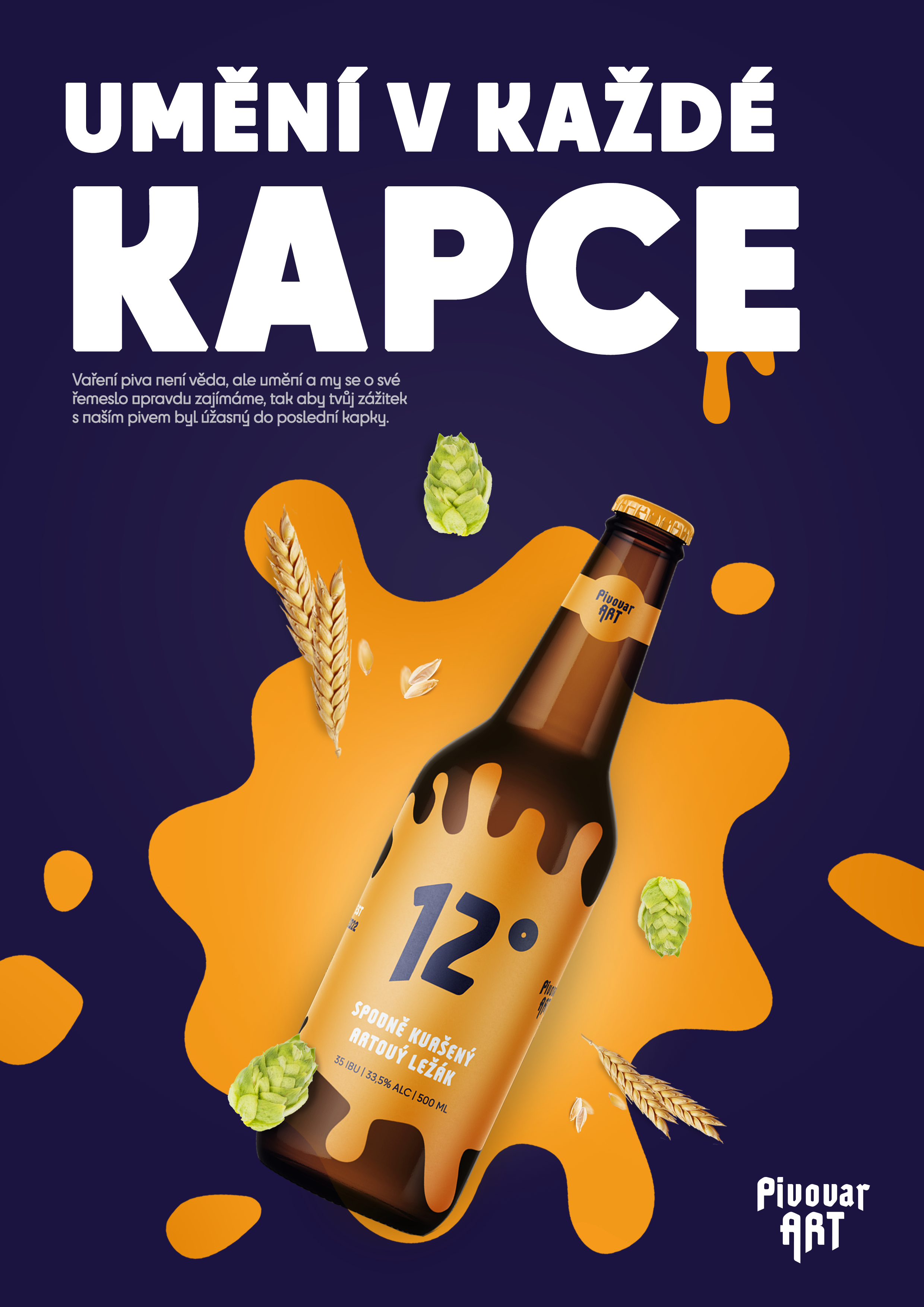
The key feature of the design is the dripping paint effect emerging from the individual letters of the logo. This emphasizes the link to art while adding a sense of dynamism and playfulness. The dripping motif ties the entire identity together—appearing across beer bottle labels, posters, and coasters. On the labels, it creates an unusual and striking border which, combined with a minimalist graphic style and bold colors, ensures that the brand stands out on store shelves and captures the attention of customers.
Key responsibilities & Tools
- Visual Identity
- Packaging
- Adobe Illustrator
- Adobe Photoshop
Showcase
Showcase