MenuClose
Social
Graphic Design
Family Market Campaigns and Creative Concepts
About
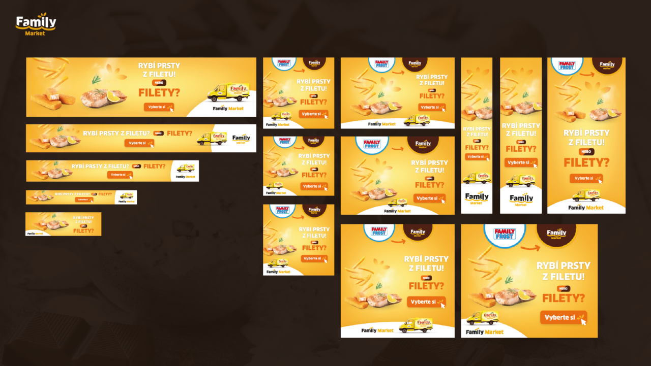
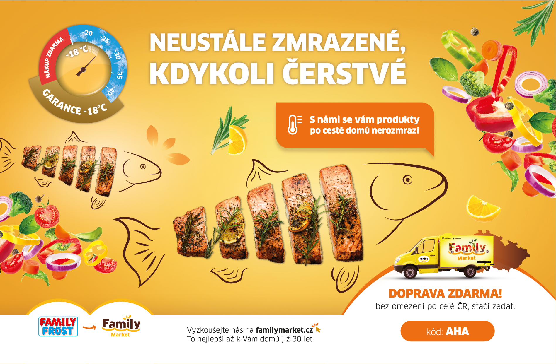
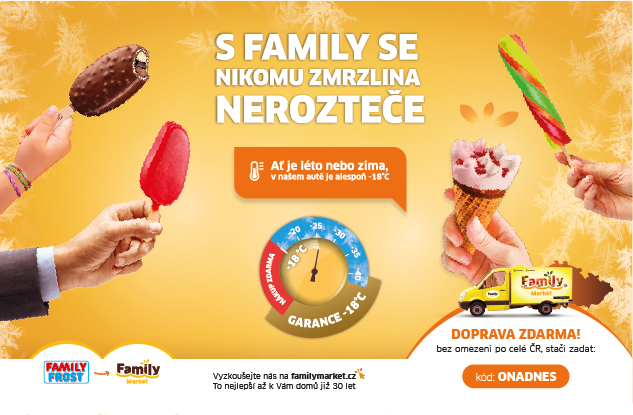
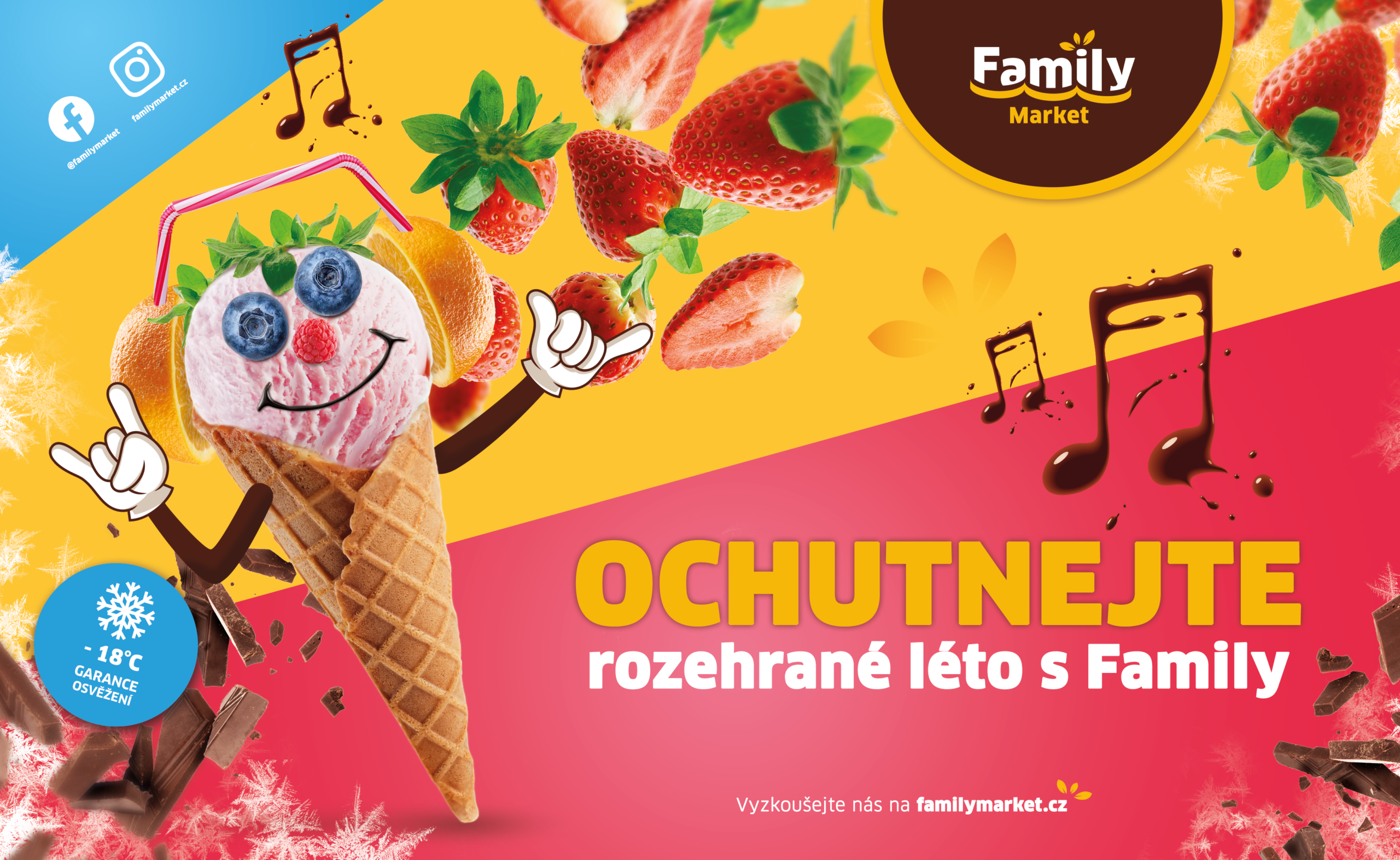
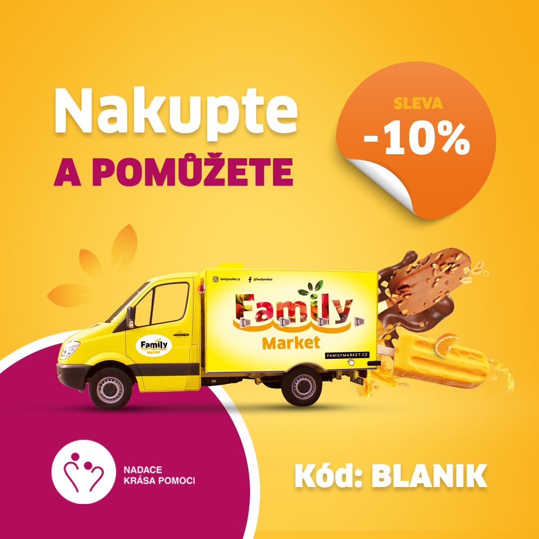
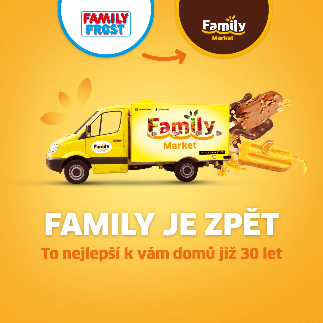
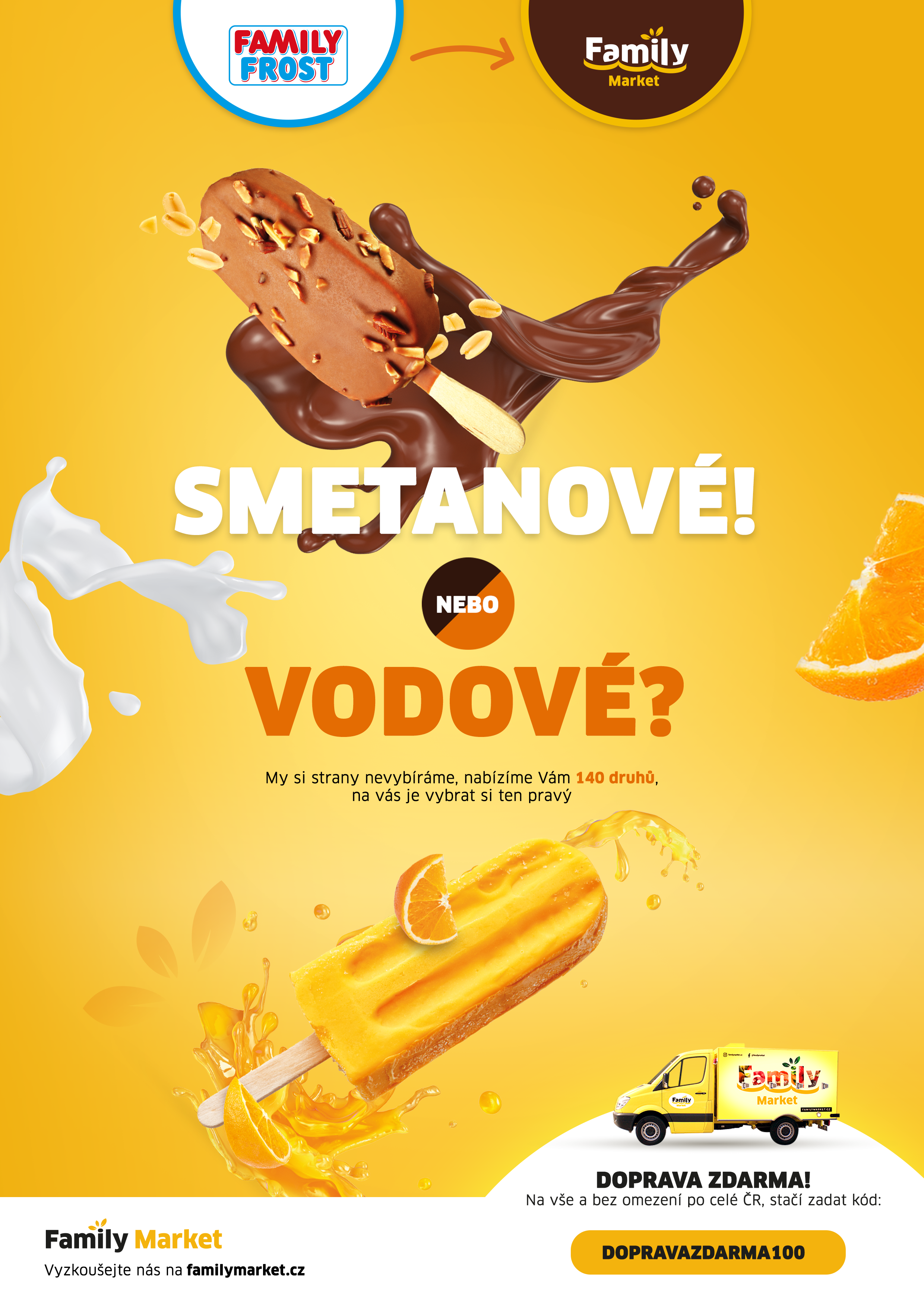
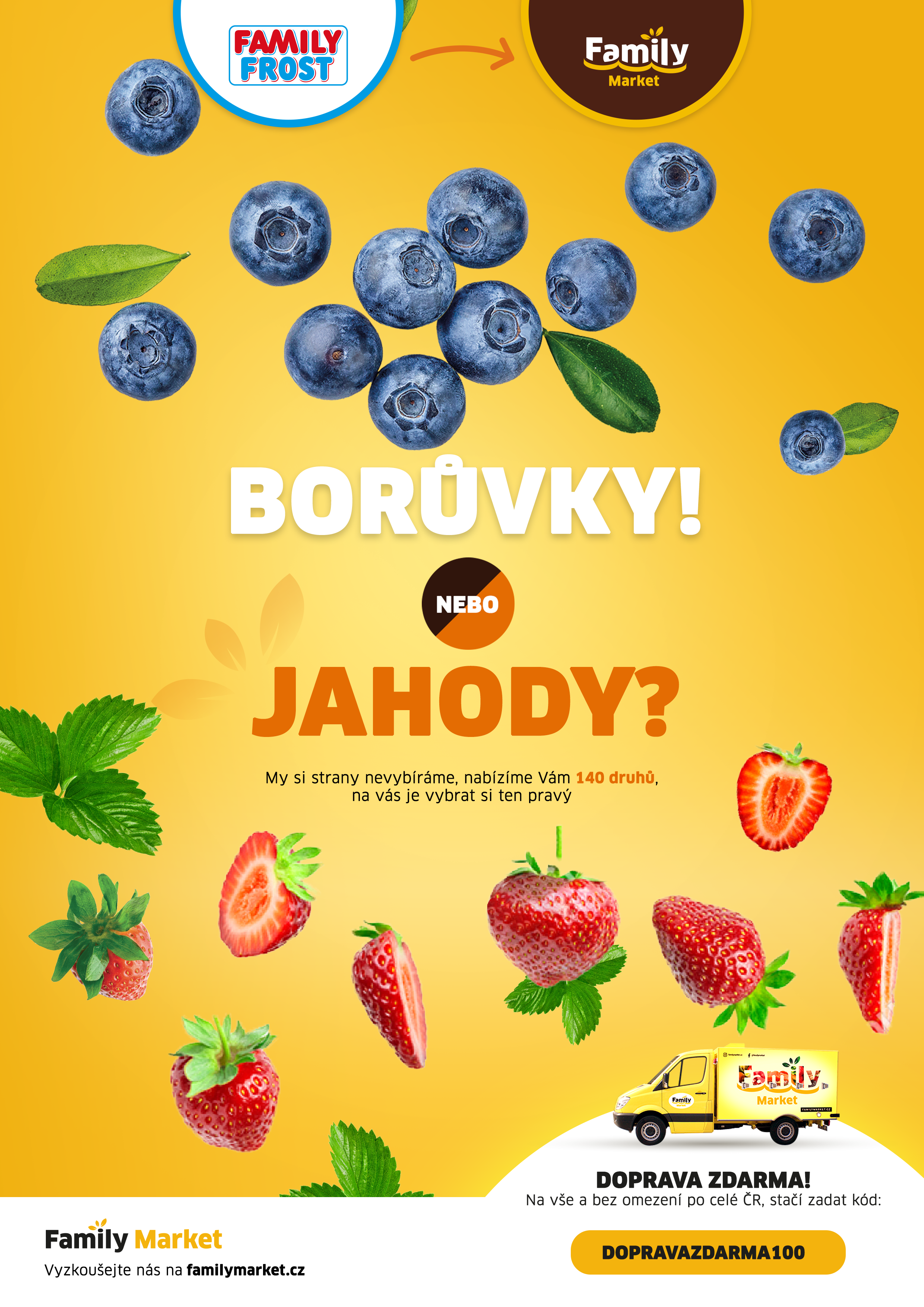
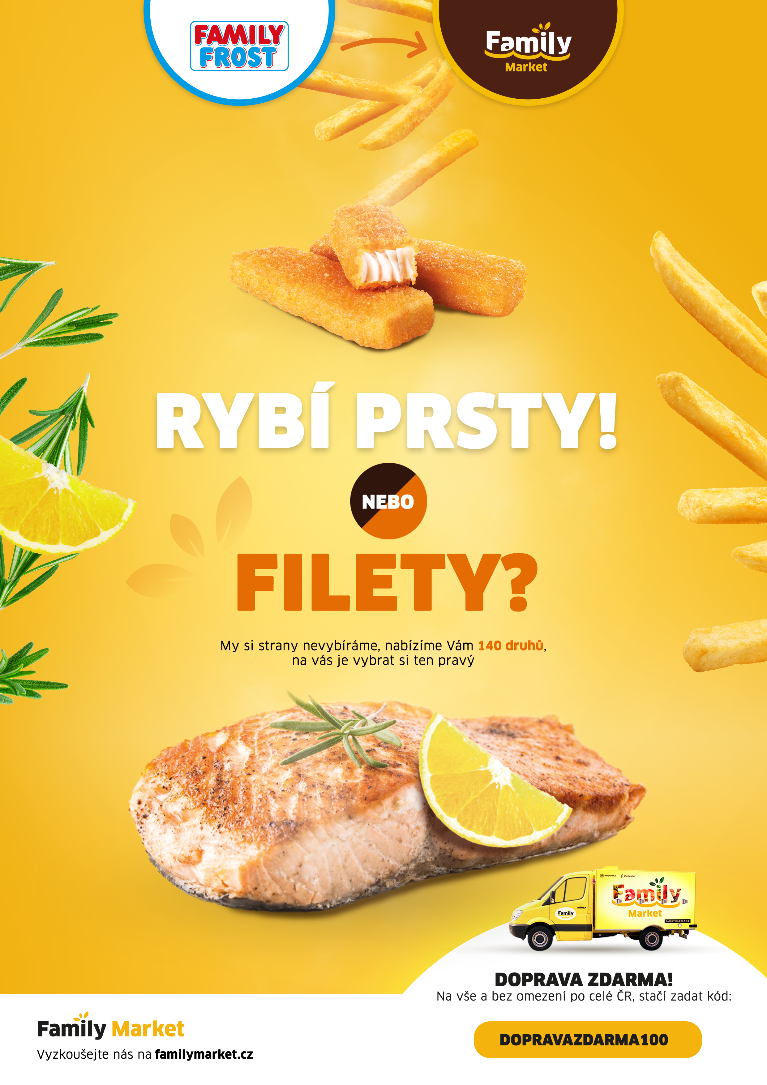
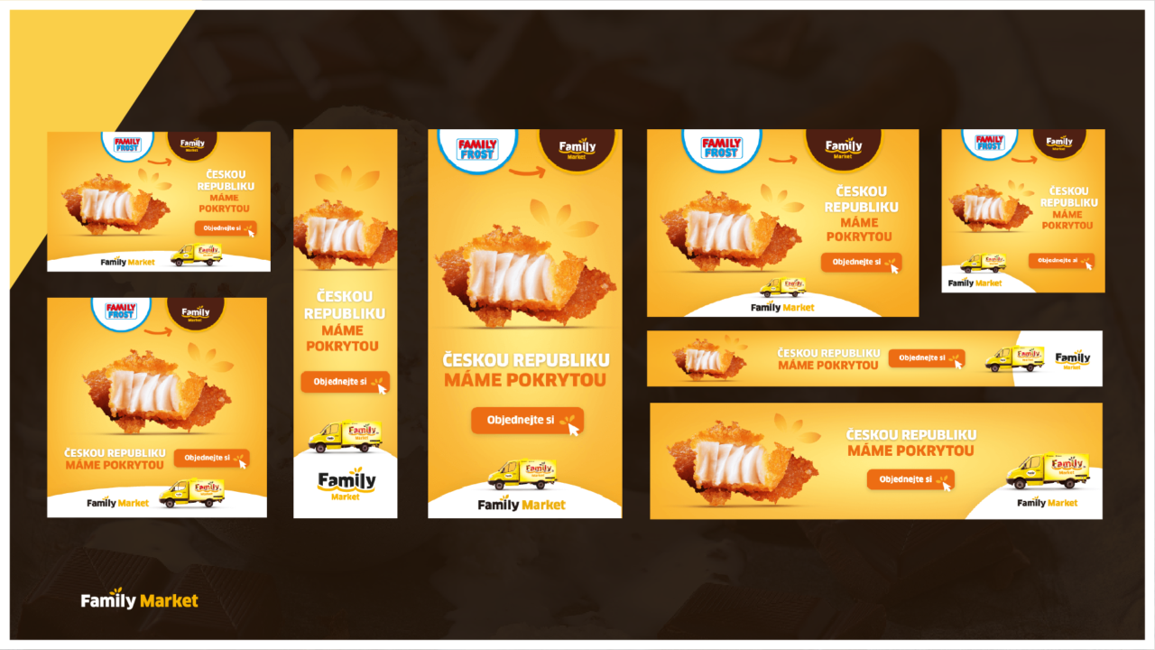
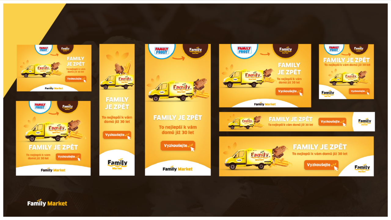
For the client Family Market, formerly known as Family Frost, I executed a comprehensive campaign related to their rebranding. The main goal was to create consistent visual and textual communication based on the newly designed logo. I defined a unified visual style across all communication channels and developed the overall creative concept for campaigns that supported the brand’s new image.
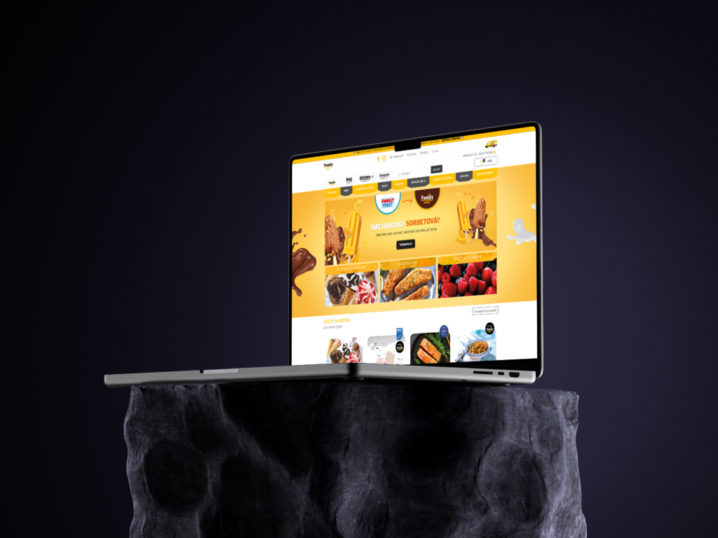
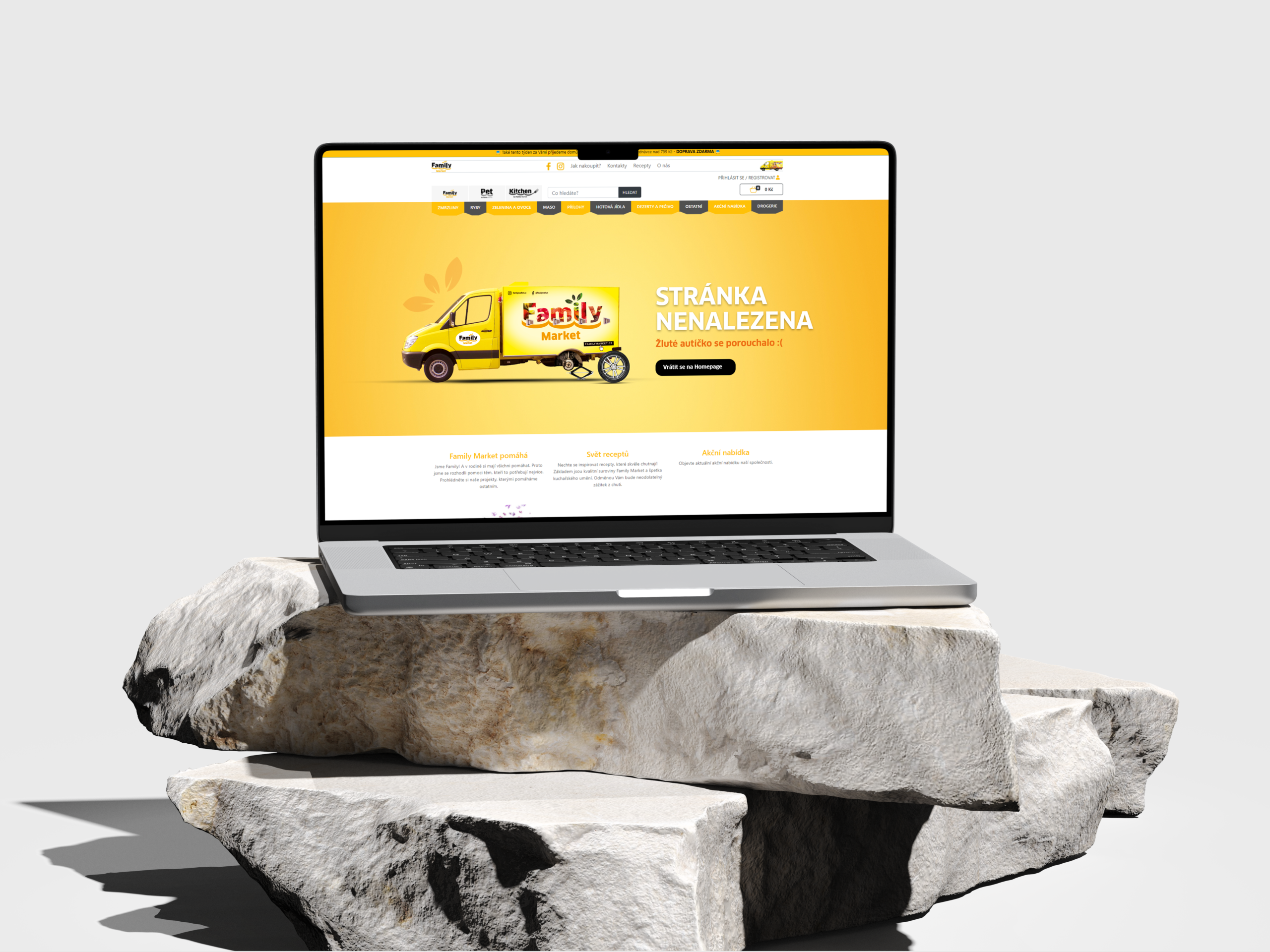
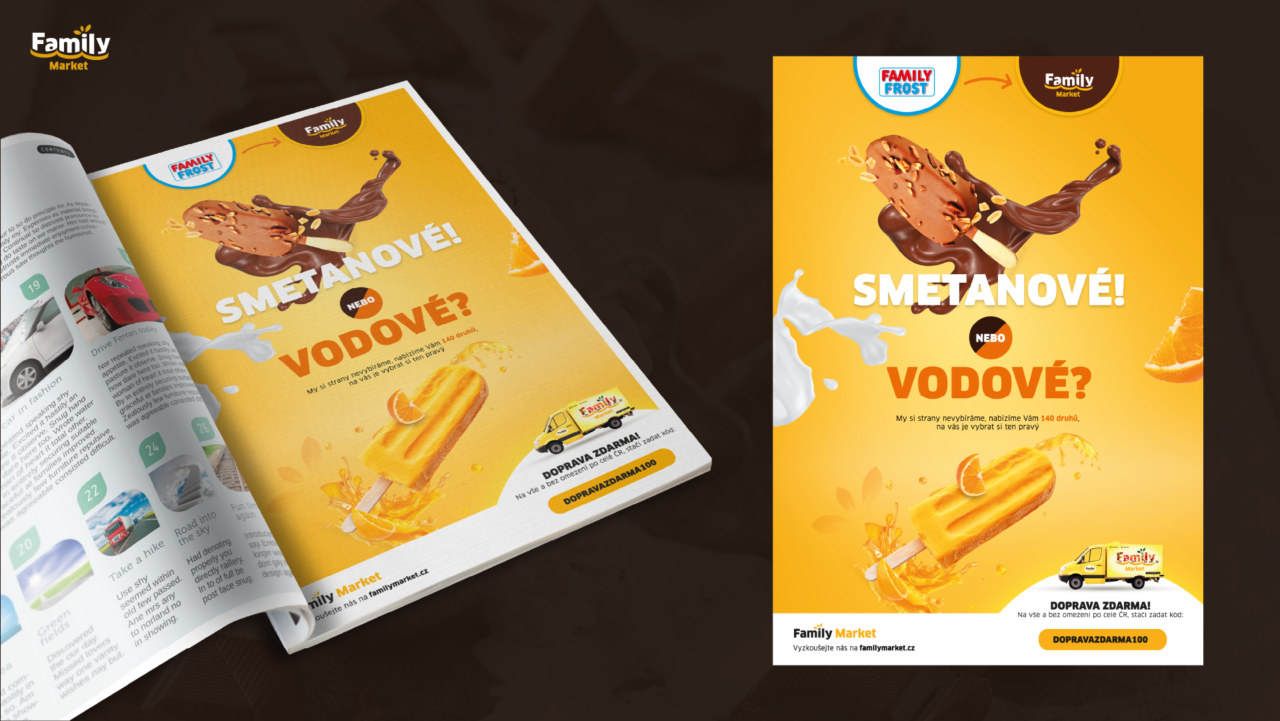
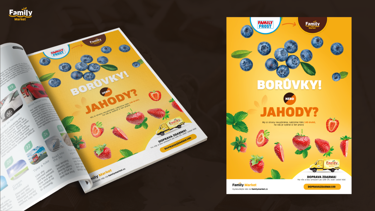
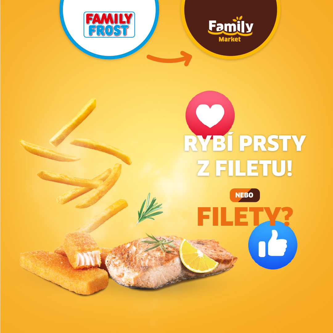
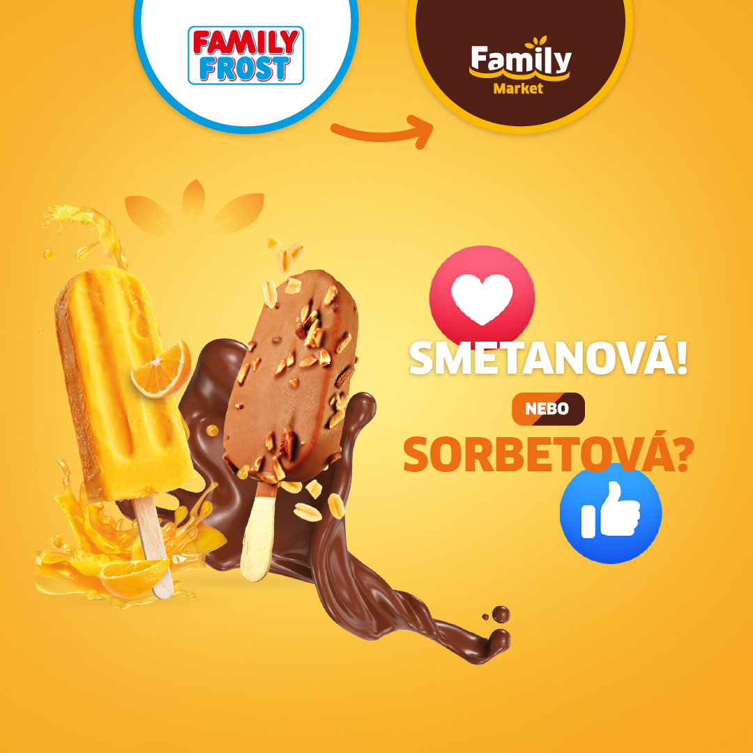
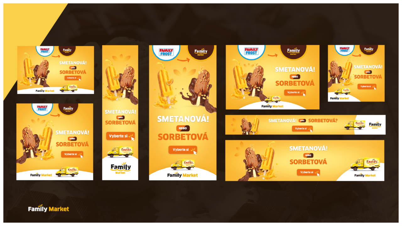
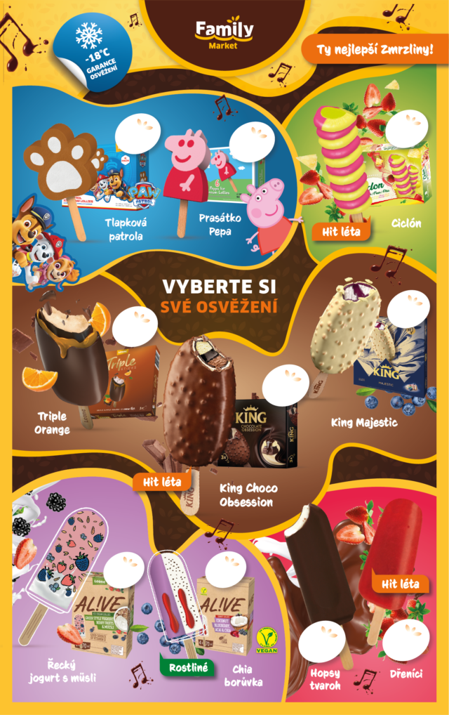
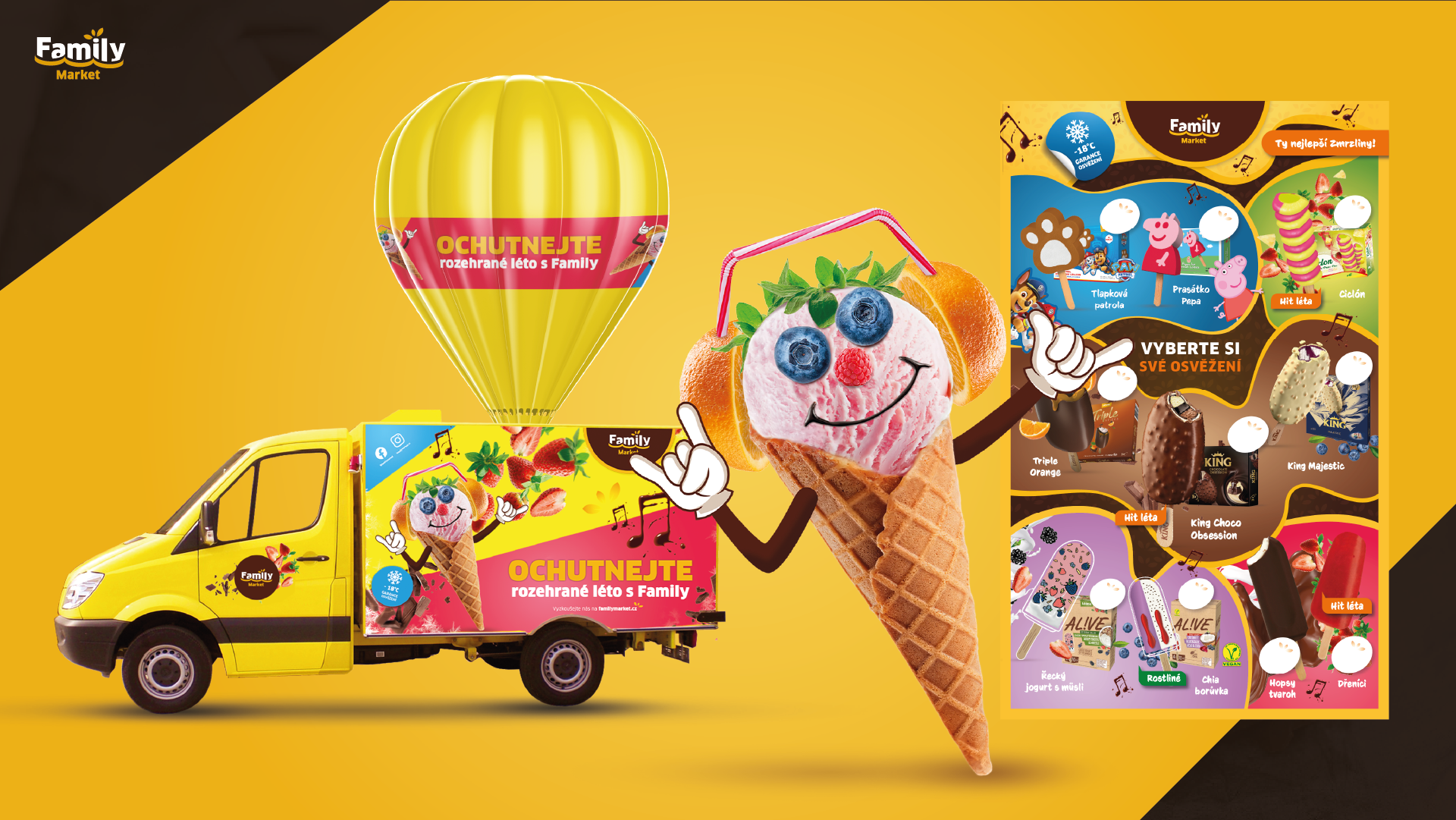
In addition to redesigning elements of the website, I worked on printed and online advertising, social media content, vehicle wraps, and a promotional mascot representing Family Market at festivals. I also prepared festival applications and other materials for participation in these events.
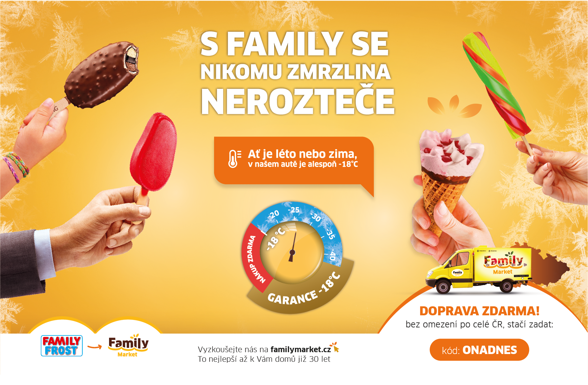
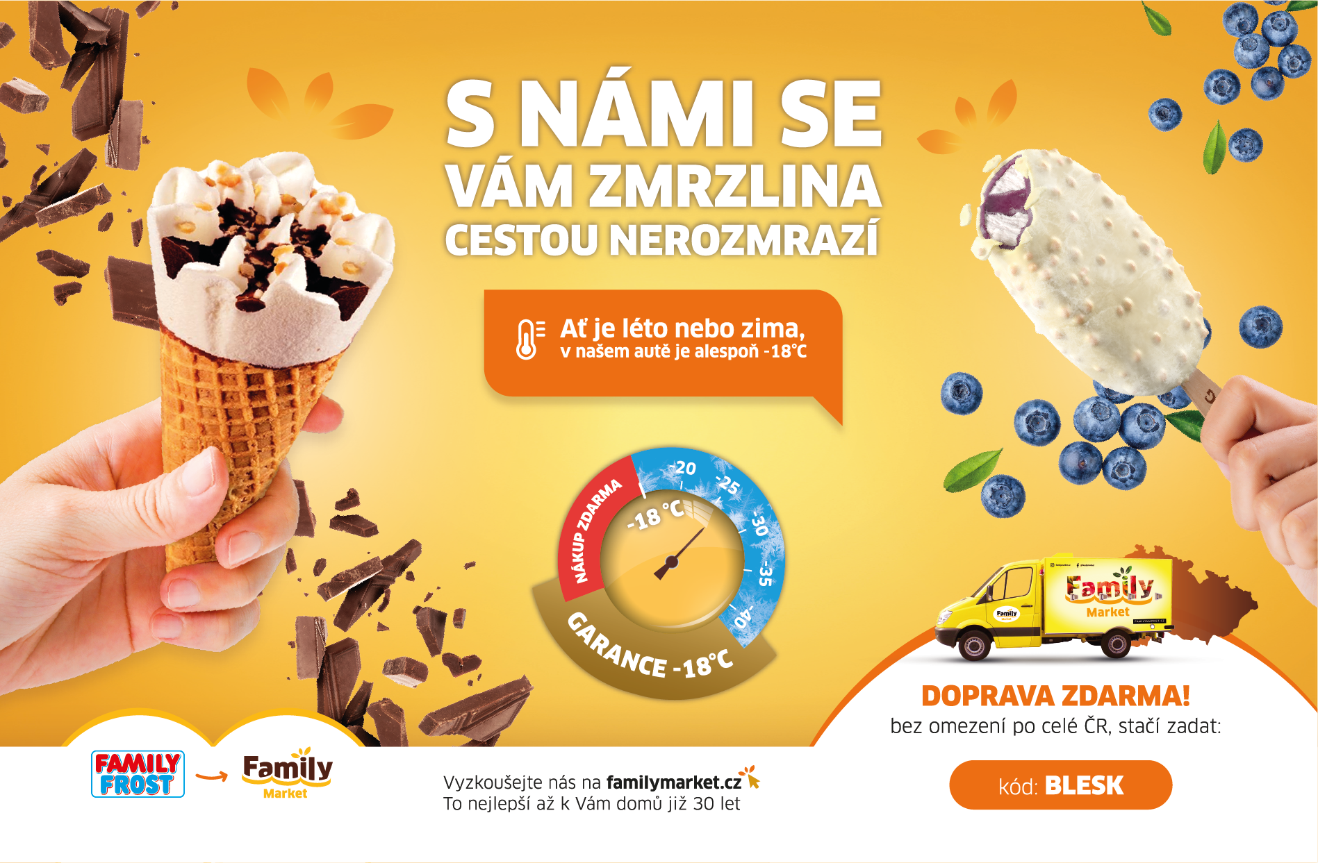
Key elements of the communication strategy emphasized the quality and taste of products, a wide product selection, and overall support of the company’s new brand. This approach not only unified all communication channels but also helped foster a positive perception of the brand change among customers.
Key responsibilities & Tools
- Webdesign
- Graphic Design
- Creative Direction
- Design concepts
- Adobe Illustrator
- Adobe Photoshop
- Figma
Showcase
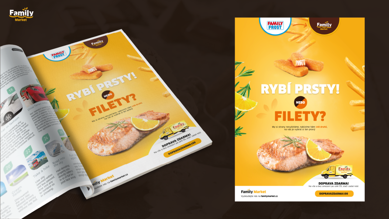
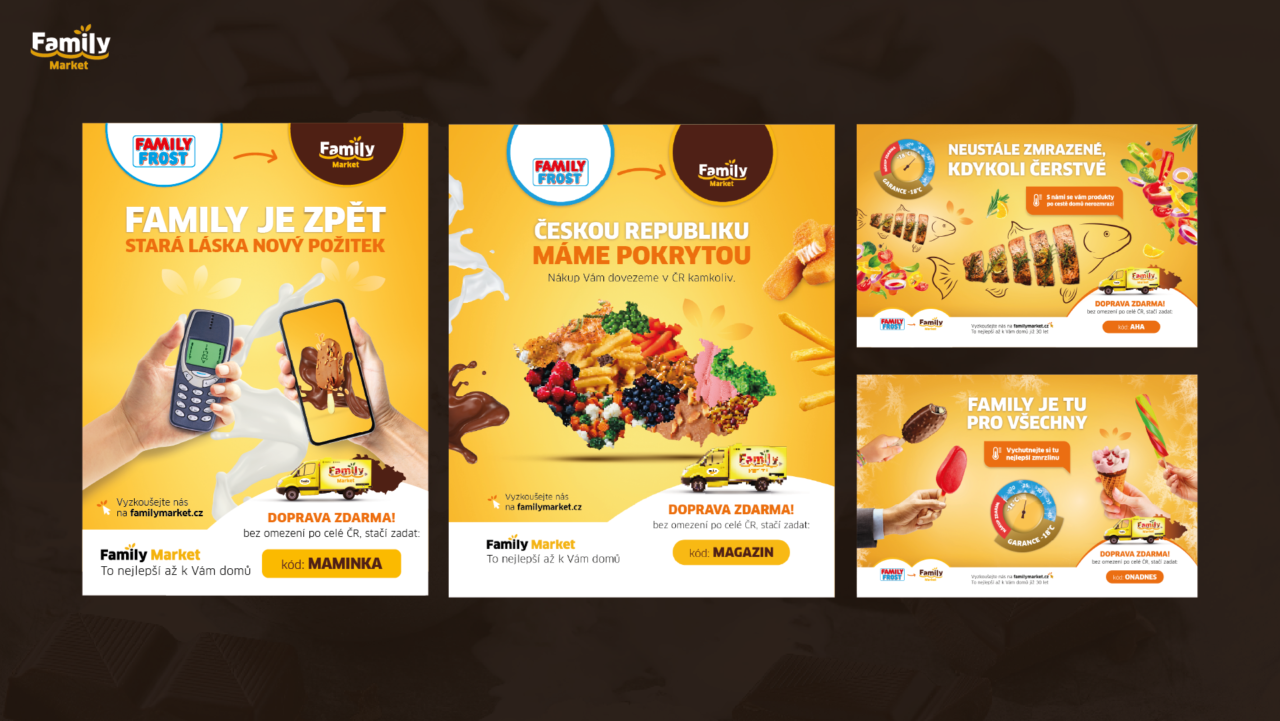
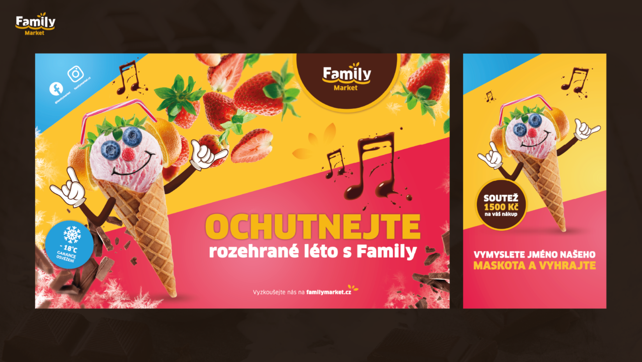
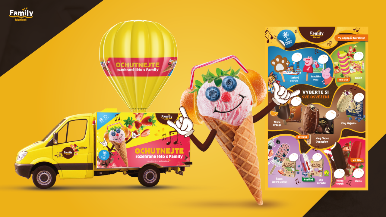
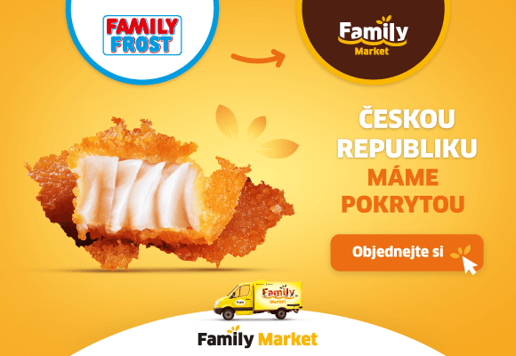
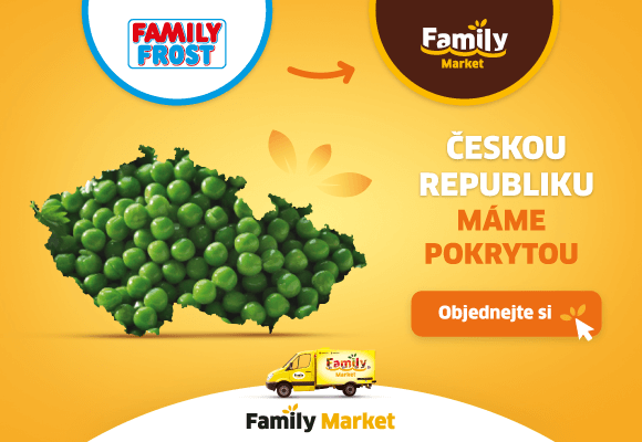
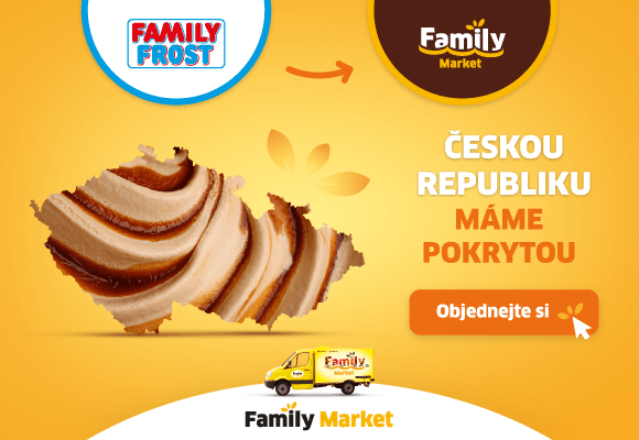
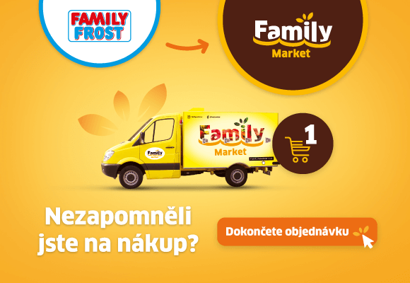
Creative Concepts for Campaigns
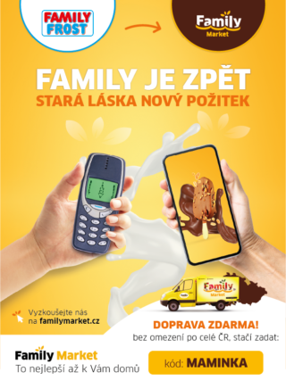
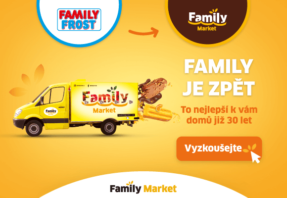
The central element of the brand campaigns for the Family Market rebranding was the core idea of the brand transformation, expressed through the slogan: “Family is back – old love, new experience.” This concept symbolized a return to tradition while highlighting the new experiences the brand offers. The creative was visually supported by the depiction of two phones—one from the Family Frost era and the other representing the new Family Market identity. This campaign became the backbone of the entire rebranding and a key element in shaping the new brand perception among customers.
Showcase
Creative Concepts for Campaigns
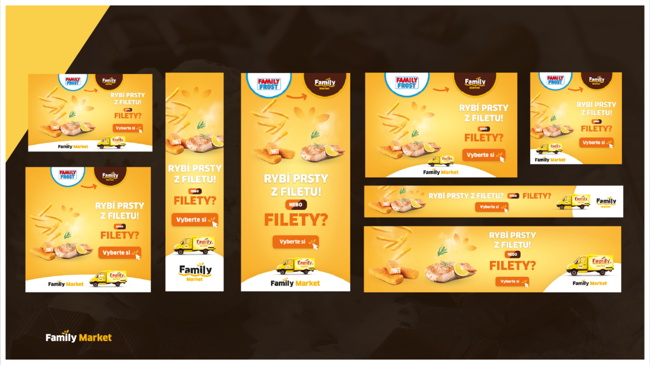
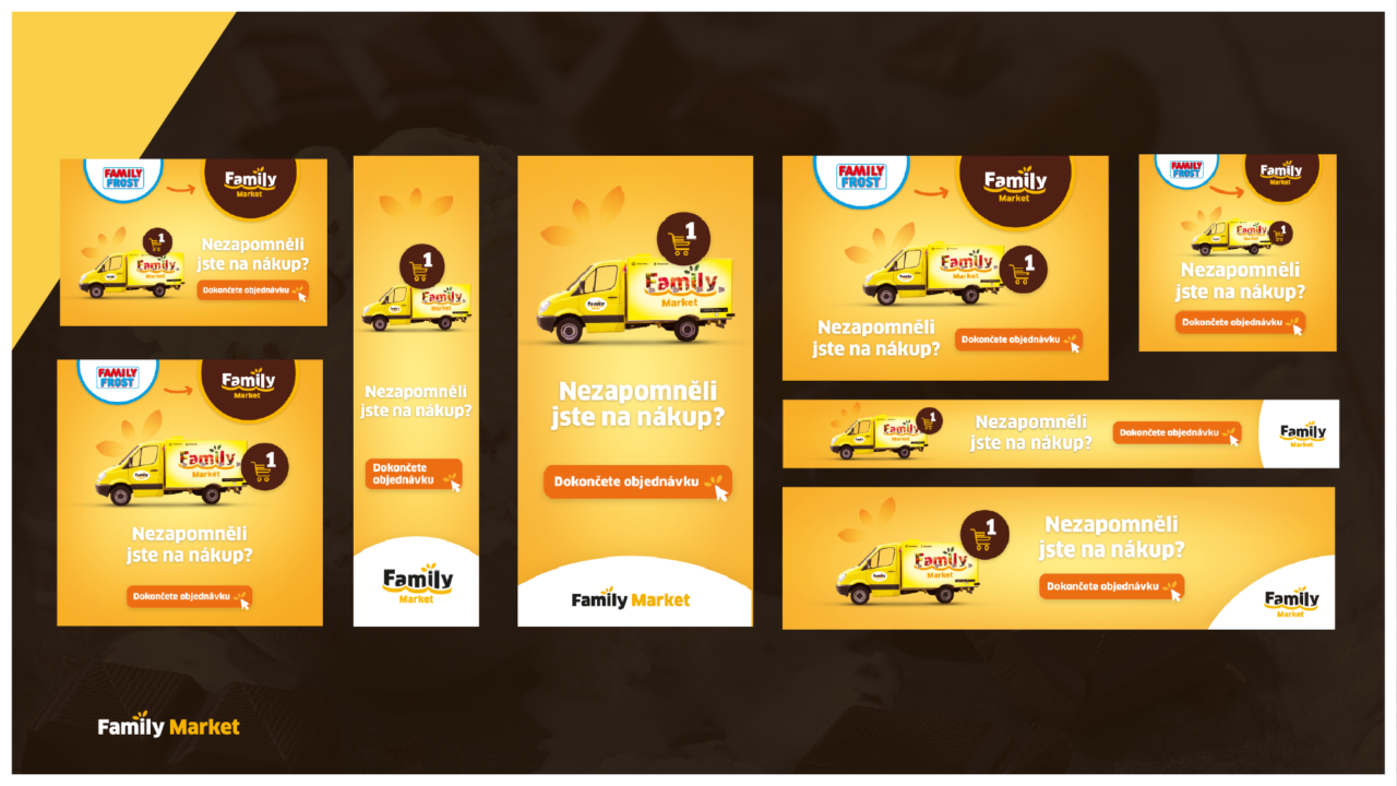
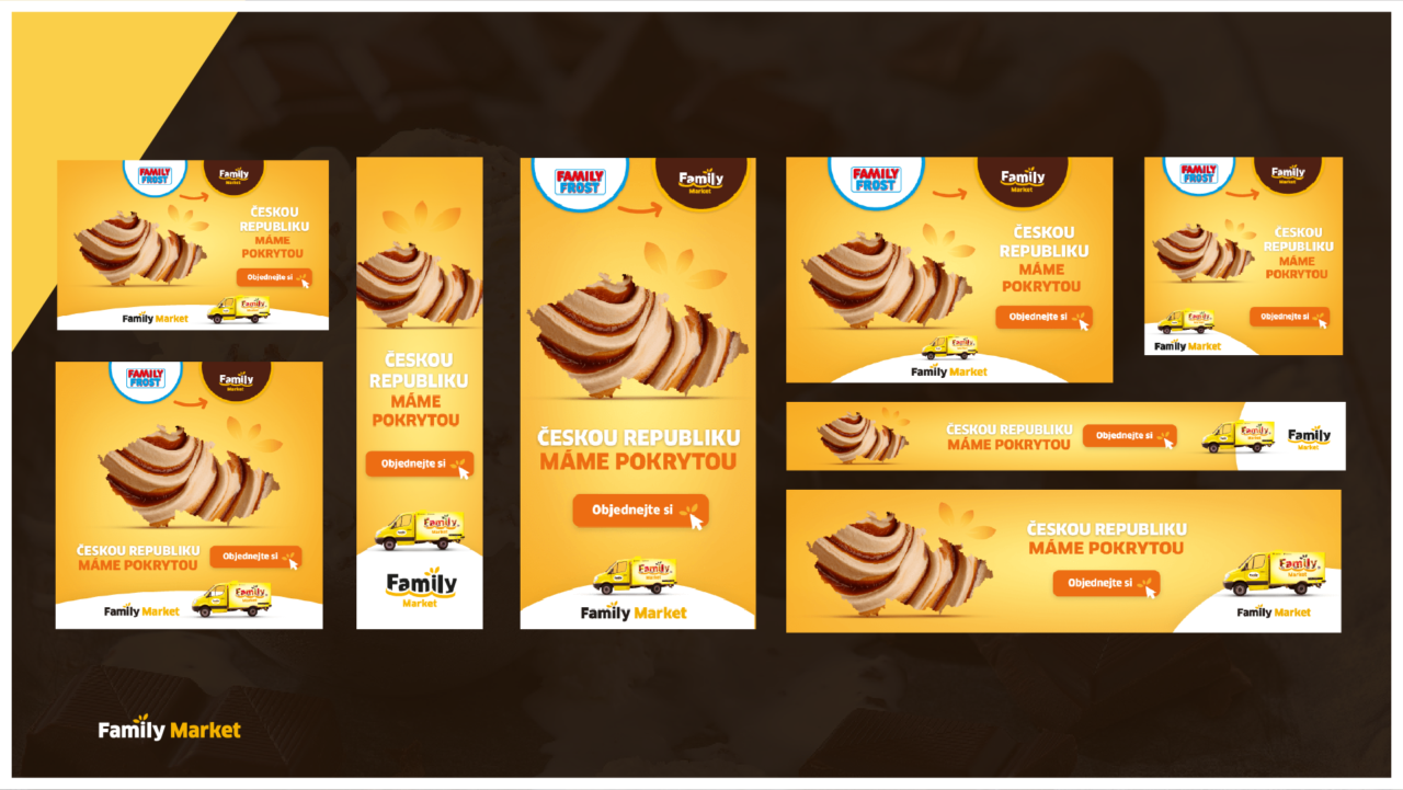
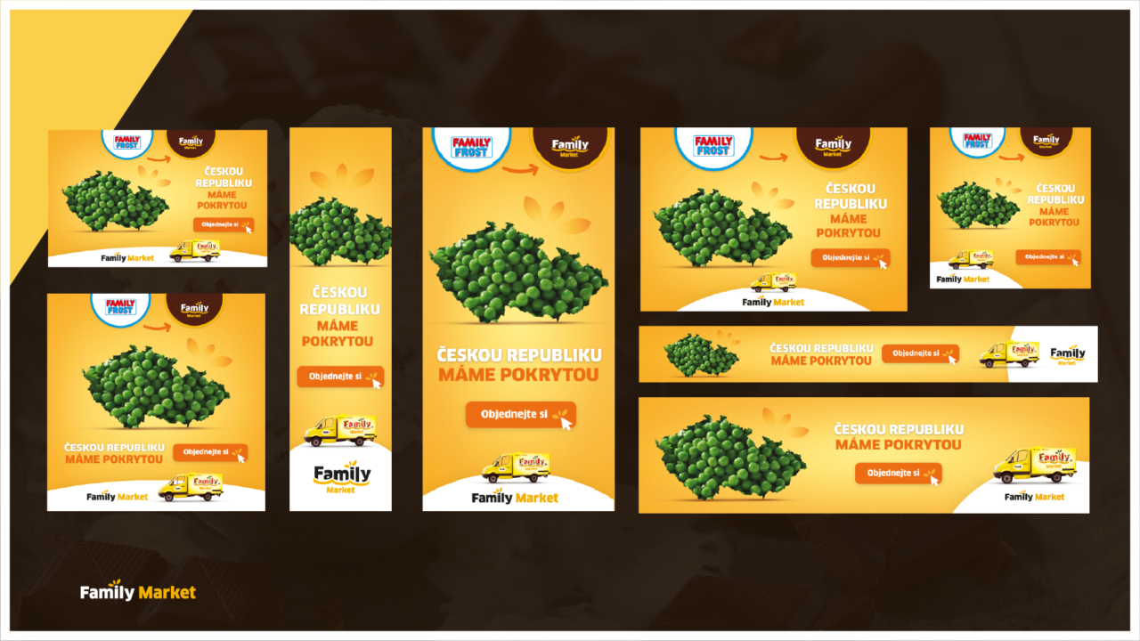
Print Design
Print Design
Small improvements for website